A a M n O 1 & Z L t p r S &
view analysis
y

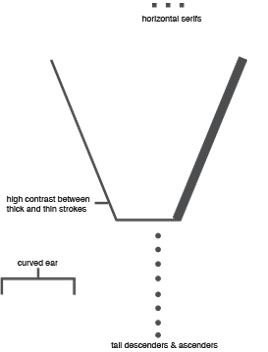
The Linotype Didot typeface (1991 by Adrian Frutiger), was a sensitive re-make of the original 1784 French typeface. It is modern; it embodies the Enlightenment with classic forms. I chose the lowercase “y” to showcase its horizontal, unbracketed serifs and tall descending ear. It is best used for headline text, especially within fashion industries. I chose this typeface because I have visited the original Didot publishing shop in Paris and love its timeless elegance.
